Customize NotyGrid labels with full control over style, position, typography, color, and spacing. Follow this step-by-step guide to create clean, readable, and publication-ready image grids with real-time preview.
Customize NotyGrid Labels Panel
What it is
The Labels panel is the central place for managing how labels appear on each grid cell in NotyGrid.
What it does
It lets you enable or disable labels and reveals advanced controls only when needed, keeping the interface clean and focused.
How to use
- Open the Labels section
- Turn on the Labels toggle
- Expand the panel to access all settings
How it behaves
- Labels OFF → all label options are hidden
- Labels ON → all controls appear instantly
Use cases
- Preparing labeled figures for scientific papers
- Creating clear image grids for presentations
- Organizing datasets with visible annotations
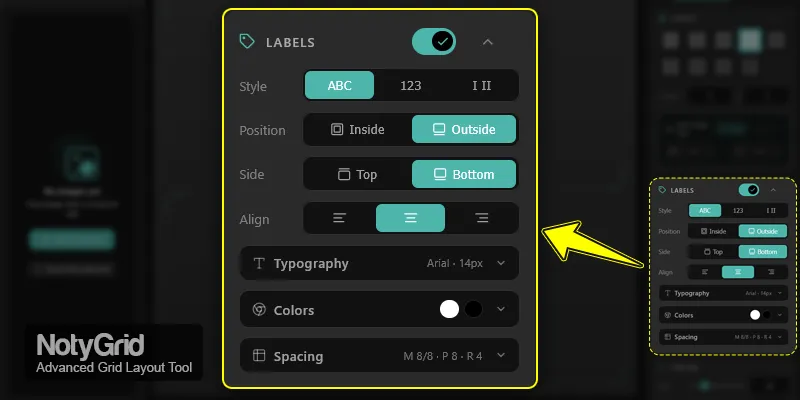
How to Change Label Style and Position in NotyGrid
What it is
Controls how labels look and where they are placed.
What it does
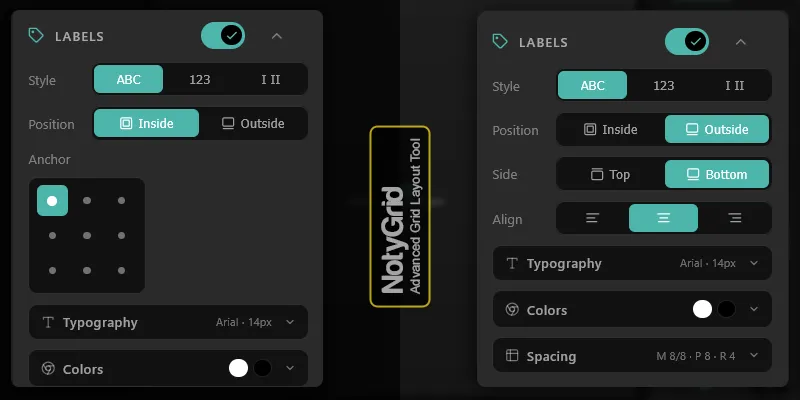
You can switch between label styles (ABC, 123, Roman) and position labels inside or outside grid cells.
How to use
- In Style, choose ABC, 123, or Roman
- In Position, choose Inside or Outside
- If Inside → select anchor point (9-point grid)
- If Outside → choose Top/Bottom and alignment
How it behaves
- Inside → anchor controls appear
- Outside → side and alignment controls appear
- Changes update instantly in preview
Use cases
- ABC labels for multi-panel figures
- Number labels for workflows
- Outside labels for uncluttered visuals
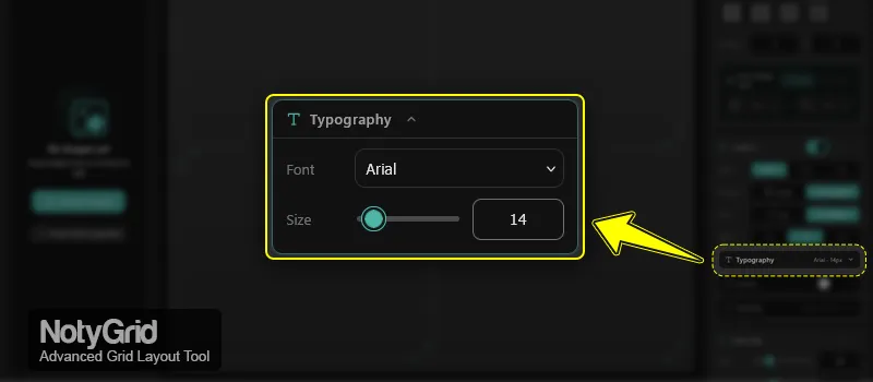
Typography Settings for NotyGrid Labels
What it is
Controls font and size of labels.
What it does
Ensures labels remain readable across different grid sizes and export formats.
How to use
- Open Typography
- Select a Font
- Adjust Size using slider or input
How it behaves
- Changes reflect instantly in preview
- Slider and input stay synchronized
Use cases
- Large fonts for slides
- Small fonts for dense grids
- Consistent typography for reports
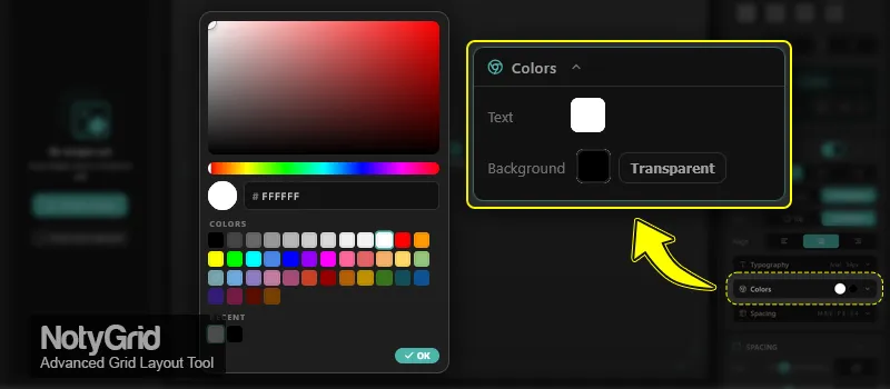
Color Controls for NotyGrid Labels
What it is
Controls label text color and background appearance.
What it does
Improves contrast, readability, and visual consistency.
How to use
- Open Colors
- Set Text color
- Set Background color (with opacity)
- Use Transparent to remove background
How it behaves
- Transparent mode removes background fill
- Colors update instantly
- Active colors are visible in UI
Use cases
- High contrast labels for accessibility
- Transparent labels for minimal design
- Branded color schemes
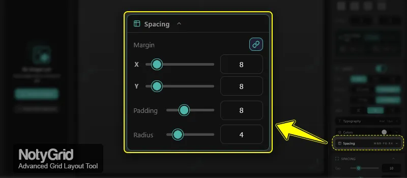
Spacing and Shape Settings in NotyGrid
What it is
Controls margin, padding, and border radius.
What it does
Defines spacing and visual shape of labels for better balance.
How to use
- Open Spacing
- Set Margin X / Y
- Use Link to sync values
- Adjust Padding
- Adjust Radius
How it behaves
- Linked mode → X/Y stay equal
- Unlinked → independent control
- Values update in real-time
Use cases
- Compact layouts with small margins
- Rounded labels for modern UI
- Extra padding for readability
Conditional Behavior
NotyGrid labels respond dynamically to your settings:
- Labels ON → settings panel appears
- Labels OFF → settings hidden
- Position = Inside → anchor controls visible
- Position = Outside → alignment controls visible
- Transparent background → no label fill
- All changes update instantly in preview
Tips for Better Results
- Use ABC labels for scientific figures
- Use Outside positioning for clean visuals
- Keep high contrast colors for readability
- Avoid very small font sizes in exports
- Preview before export → see: How to Export Images in NotyGrid